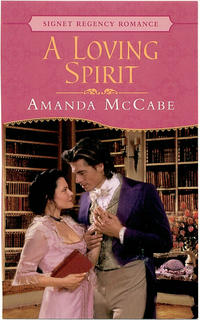
 After all this talk about cleavage and highlights and strange outfits, I thought you might enjoy seeing this cover! The guy from “Grease” and the girl who buys her clothes at Victoria’s Secret. At least they read…
Unlike the GF couple, who spend all their time in the gaming hell. Tsk tsk.

Ooph…is that a nipple I’m seeing??
I actually like the cover for A Loving Spirit. Mainly just because I love the look on her face. The cleavage and guy are just ‘eh’.
LOL, Nicole!
Just looking at these covers, I realize I really like the “The Golden Feather” cover. The colors are fantastic, and go together splendidly, and there’s a real style to the whole thing.
The cover for “A Loving Spirit” is, I think, just not as successful. Not even mentioning the whole mousse & highlights thing, or her “nightgown,” I think the colors are muddy, her hair looks rather messy (in a messy way, rather than a charming way), and there isn’t a lot of energy to it. There’s tons of energy in the “Golden Feather” cover.
So Amanda, are you willing to share how close these two illustrations are to the info you sent in? Were these scenes your #1 recommendations? (Two? Three? I have asked Elena a similar question, because I find this sort of thing fascinating, so perhaps others do too!)
Cara
They ARE technically the #1 scenes I described on my cover sheets. The Golden Feather has a heroine who runs a swanky gaming hell (at least in the beginning), so I suggested they put them in a setting with cards, etc. In A LOVING SPIRIT, the hero is a scholar who spends a lot of time in the library, and the heroine is a bit of a free spirit from the islands who dresses flamboyantly (thought not negligee flamboyant!!). I think they’ve actually used my #1 suggestions on almost all my books, though never exactly the way I pictured. :))
I always think this is interesting, too! I love hearing from authors about what they think of their covers and how they relate (or don’t relate) to the story within.