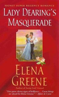
 I meant to post this earlier. Anyway, here ’tis!
The heroine looks exactly right; the hero not quite. When you look close (fortunately the image is small) he looks a bit geeky, not at all like Colin Firth whom I used in my mental film of the story. But I do like the open shirt; it is actually right for that scene as I have Sir Jeremy doing some gardening on a hot day. Of course, going without cravat, coat and waistcoat is half-naked for a Regency gentleman. 🙂
And I like the red background. My editor asked me if I’d like pink or red and I chose the latter as more eye-catching and suggestive.
The scene itself was my second choice. My first was the initial masquerade scene, in which he’s in black and she’s in white. I think that would have made for a more bold, graphic effect against the red and also tied in with the title. This one is nice, though a bit pastel-y against the red.
Overall, though, I’m happy with this cover. And a bit stunned to see my name in such large letters!
Elena
www.elenagreene.com

Elena:
I love the red. Very striking. And I like how the two look involved with each other.
It is neat to see your name in letters significantly larger than the title letters! 🙂 And I agree — the red is quite eye-catching. So you’re saying you were actually given a choice of color?
Cara
Very cool cover. Congrats!
I don’t think I’ve (yet) read a Super Regency. Are all their covers like this? Quite different from the usual Regencies…
Todd-without-qualification
I think the older Super Regencies (some of which have been reissued as historical romances) had similar covers to the rest of the line. The only difference was the thickness and that it said “Super Regency” somewhere on the cover.
I don’t know when Signet went to this small picture inset for the Super Regencies, but I like it.
Cara, my editor did ask me my preference of color. I don’t know if my opinion actually made the difference, or if others agreed with it too.
Wouldn’t it be cool to be a fly on the wall during those cover art meetings?
I love the shade of red! It’s very eye-catching and vivid. I agree that a black and white scene would have set it off very well, but this one looks good, too. 🙂
On my Super Regency (Lady in Disguise, though can’t recall the exact date–a couple of years ago?) it had the same design. Small image, slightly textured color (though in a dark lavendar instead of red), bigger lettering.