 Folks who’ve been reading this blog for a while know that I love to talk about covers…
What’s good, what’s bad, what we like, what we don’t like…
What we think enhances the experience of the book, or hurts it…
 And whether it’s even possible for a bad cover to diminish one’s reading experience…
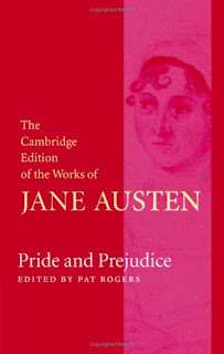
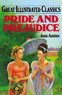
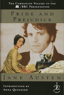
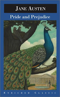
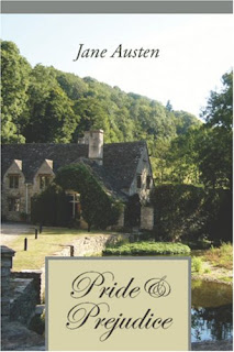 Here are a whole bunch of different Pride and Prejudice covers.
(I found them on a neat website, http://www.fantasticfiction.co.uk, which has a lot of fascinating stuff on it.)
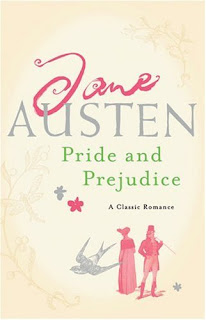
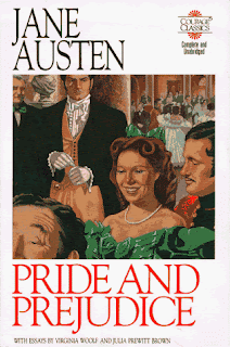 Which covers do you like? Which is your favorite? Why?
Which do you hate? Which do you think is the very worst? (And why?)
Do you think any of these covers are good enough or bad enough to change a person’s reading experience one iota?
And remember — next Tuesday (always the first Tuesday of the month!) is our JANE AUSTEN MOVIE CLUB. Stop by to discuss the Colin Firth/Jennifer Ehle version of Pride and Prejudice!
Cara
Cara King, author of My Lady Gamester, who can’t always think up something clever to say in her sig line

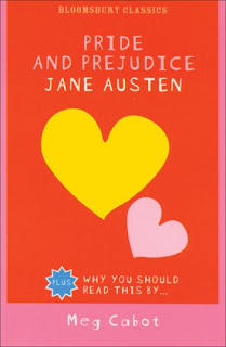
I hate some of the covers–the Great Illustrated and Courage Classics–but like the others. I love seeing the variety, though, thanks for posting them!
I like the Meg Cabot cover.
Sometimes you have to hit teenagers over the head with a good thing 🙂
Glad you enjoyed them, Megan (a.k.a. pulp cover goddess)! Now all we need are some pulp Austen covers — Catherine Morland tied up by gothic villains, Mr. Tilney in a fist-fight…
Sorry. 🙂
Yes, the Great Illustrated one was at first the one that made me cringe the most — I’ve always thought that series looks so immensely childish. Though I suppose the cover illustration itself is not as bad as it could be — but the colors and the title font and all are so groan-worthy.
The Courage Classics one is my least favorite. Is that a huge green bow on top of her head, or what?? 🙂
Gillian, I admit I still haven’t made up my mind about the Meg Cabot cover. It’s cute and accessible, and doesn’t have anachronistic costumes, which I’m grateful for. But part of me wonders if someone who picked it up thinking it would read like, say, a modern chick-lit novel or chatty YA would actually read very far…
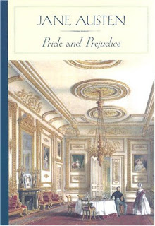
I think the top left cover is my favorite — even though the costumes are from the wrong period! I just get a happy glow every time I look at it.
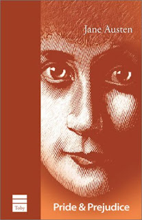
I think the staring face (second on the right) creeps me out…
Cara
OK, is it just me, or does the Toby cover (with the big looming face) look very, very creepy? More like a horror novel than a romance. Elizabeth Bennet, serial killer. She stalks the night! See her face in your window and scream!
OK, sorry about that. About the others…
I like peacocks, in general. To my recollection there isn’t one in the book, but what the heck. It’s colorful. And I like the first one (with the big drawing room) and the one with the picture of the country house.
And just to prove that I do like some covers with people on them, I like the Colin Firth/Jennifer Ehle one. And only partly because it has the delightful Jennifer Ehle on the cover, looking, well, delightful.
Aside from looking like a comic book, I don’t mind the Great Illustrated Classics one too much. But doesn’t it look like the one on the right is going to scalp the one on the left with her parasol?
What an amazingly large number of covers. And I bet there are many, many more…in fact, of the at least two copies we own, neither of those covers are present. It says a lot about the enduring quality of the book.
Todd-who-will-have-nightmares-about-that-horror-cover-tonight
Is the Courage Classics one based on the 1940 movie? It’s good for a laugh–as were the costumes in that film.
I’d say my favorite is the top version though others were nice too.
Oh and just to add another weird one to the collection, here’s the link to my blog on the Lithuanian translation my mom got me.
here’s the link to my blog on the Lithuanian translation my mom got me.
Ah, yes. Elizabeth Bennet, Renaissance Flute Player. Excellent addition to the gallery. 🙂
Cara
I’m with Todd:
The peacock because it’s a good illustration and I’m an illustrator.
The house because I can imagine myself as Elizabeth Bennet walking into that scene.
The A&E P&P because it’s a good juxtaposition of the characters and their individual expressions. Plus I liked the mini-series. And Colin Firth doesn’t hurt.
Janegeorge and I were separated at birth. She picked my three favorite covers, too.
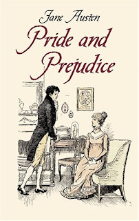
That peacock one is probably my absolute worst of the lot. And Cotswoldish one? To die over. Love it! And also the Cruikshankish one.
What I want to know is where’s the Knightley-MacFadyen cover???
Covers have made me pick up a book. In the past, they used to make me not buy a book. The past year spent on romance blogs and boards has shored up my courage. (Or is it that I’m older and so couldn’t care less what the cashier thinks?) Then again, meeting this fabulous bookseller who shares my love of romance novels and is always up for a coze whenever I visit has also gone a long way towards making me take my purchases up to the front in person, rather than buying them online.
The Colin Firth cover works for me, as does the peacock one. The Meg Cabot one reminds me of The Partridge Family but if it gets teenagers interested than I’m all for it.
*The Meg Cabot one reminds me of The Partridge Family…*
LOL. Laurie Partridge as Lizzie Bennet.
Janegeorge wrote:
I’m with Todd:
That warms me exceedingly! 🙂 I thought I’d be alone in liking the peacock. Vain creatures though they are. In the LA Arboretum (not too far from where I live) there are peacocks that wander around freely, looking eye-catching and decorative and useless. If they only had a cravat (and a hedgehog for a valet) they could give Bertie a run for his money.
Keira wrote:
What I want to know is where’s the Knightley-MacFadyen cover???
I suppose that I could contemplate Keira Knightley from time to time…just as a break from contemplating Jennifer Ehle, you understand…
Todd-who-spends-much-of-his-time-in-contemplation
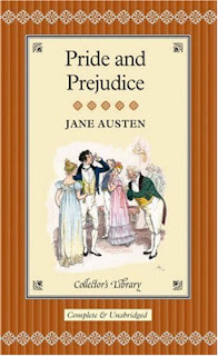
My favorites are the first three, but especially the very first one. It’s gorgeous!
~Andrea
I like the first two and the one next to the RED Cambridge edition. I like period type covers and I love great appropriate photo covers. I am not real big on artistic license when it comes to covers for classics. I like something that draws you in and gives you a taste of what the book is about.
The Courage Classics is creepy–the P&P wax museum.
I like the peacock one, too, Todd!
I think the Meg Cabot one is just silly and girly.
I have the B&N small hardcover one, the one with the brown/tan/whatever it is striped one. . . just mine don’t have pics on the cover. 🙁 LOL And it took forever to get all of them (yeah, yeah, I could have asked and ordered, but hey, it’s more fun this way LOL)
But I’m not picky as long as it’s related/relevant. . . the correct clothes, Jane, any of those. . .
But I WANT the one with Colin!!!!
*cough* Anyway. . . moving on. . . 😉 And you can’t go wrong with flowers or some other neutral item that you can’t complain is totally incorrect for the time period. LOL 🙂
But um, yeah, Colin, two thumbs up. 🙂
Lois
What I want to know is where’s the Knightley-MacFadyen cover???
Actually, Keira, I almost added that one — but I already had a lot of covers, so I decided the Firth/Ehle covered could represent movie-photo covers in general. Sorry!
And besides, Macfadyen is awfully blurry and backgroundish in the pic… What you really want to be looking at is this… Austen Heartthrobs 🙂
Cara
The Courage Classics is creepy–the P&P wax museum.
Soon to appear at Madame Tussaud’s, right next to Michael Jackson and Jack the Ripper… 🙂
But um, yeah, Colin, two thumbs up. 🙂
Okay, Lois, you can have Colin, but I get Jeremy Northam. (Okay, wait, I’m already sharing him with someone, aren’t I???)
Cara
(I just found your blog via a comment on Writer Unboxed. It’s great!)
Someone mentioned this already, but the Courage Classics one has always made me think of Laurence Olivier. Seriously, Google it. It’s him!
And though Olivier is delicious, it’s not exactly my favorite P&P movie adaptation (those Scarlett O’Hara dresses make me feel vomitous).
I’m also looking for the Macfadyen cover — Mr. Darcy coming towards us in the fog. The Great Romantic Hero Walk, as I like to call it. Sigh!
I have the hardcover Everyman’s Library edition. And the tiny little Barnes & Noble one for my purse. Sooo pretty.
(I just found your blog via a comment on Writer Unboxed. It’s great!)
Glad to have you here, Steph!
And I see what you mean about Olivier… I guess that accounts for the poofy dresses on the Courage cover as well!
Cara