Today (or tomorrow) I’m the Take Ten With guest at Cover Cafe, talking about the bookcovers in my life.
We’ve addressed the topic of bookcovers a few times at Risky Regencies, most recently by Elena. It’s a topic I never tire of. I love how romance covers follow trends, like clinch covers and decapitated people. I thought I’d see what the current trends seem to be.
I peeked into Amazon, Barnes & Noble, and some Romance review sites and looked at the romance covers for October.
In Regency and Victorian historical romances the trend seems to be toward featuring the heroine on the cover, usually in a beautiful dress that might be half-off. Here’s a sample:
Interestingly enough, Scottish Historicals did feature the hero. And Westerns.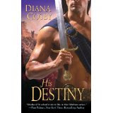
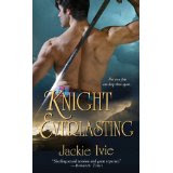
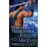

There were still a few traditional covers:
Funny, my recent covers show all the trends. Traditional. Hero-featured. Heroine-featured:
Do you agree with my conclusions? What trends do you see? What kind of covers do you prefer?
Speaking of covers….October 1 was the release for my new Undone short eStory. The Liberation of Miss Finch tells the story of what happened to Claude, the boy my three soldiers rescued at Badajoz. Check my website to see what else is new and to enter my contest.
Leave a comment on my blog on Thursday for a chance to win a signed copy of Regency Improprieties.


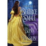
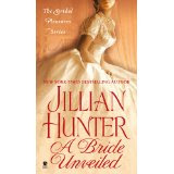
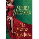
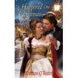
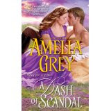
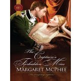


I’ve seen this trend myself with the dress half off and I’m not sure I like it. Lady in a dress is fine, but please keep it on. I do like the hero on the cover, though.
I like the hero on the cover, too. I’m not sure that a cover with a woman in a pretty dress is enough to draw me to a book. But a really handsome, intriguing hero….I’m all there.
I do agree with your conclusions about the covers and I think it’s because the emphasis on the covers kind of reflects the emphasis in the books…most of the Regency romances I’ve read seem to focus on the heroines search/journey to love and are focused on the “Ton” and what was expected of women whereas on the Scottish historicals and Westerns the focus seems to be on the “wildness” or “ruggedness” of the hero and how he’s the perfect match because of it. I think the traditionals just reflect the fact the romance is between a man and a woman
I just want the hero on the cover, preferably one of my favorite models and in a state of undress. Of course, my opinion may be different because I do collect books with my favorite models on them.
I have also noted these trends. I do like a tastful and subtle cover as opposed to a raunchy one. I have a preference toward romantic covers. It’s the colours, fashions and landscape that can make a cover stand out. More important though I want the cover to suit the story. Sometimes seeing a hero on the cover shirtless can get corny and also predictable. I want there to be more to it. I like details 🙂
Great overview and some insightful comments. The covers begin to look a little…generic. One dress is like another except for color. (And forgive me, one bare chest, too.) I’d love to see something that really conveys the story.
I don’t really notice the “trends.” A cover may catch my eye, but it isn’t the deciding factor if I buy a book. I must admit that Diane has had some lovely covers that I was very glad to own. 🙂 The closest I’ve come to collecting covers was Richard Cerqueira, not that I’ve ever been shy about that. I’ve also bought a book or two for Jimmy Thomas. 😀
I think your tracking of the trends is spot on. I do love the brighter colors and the more detailed portrayals in covers these days. Not so impressionistic and pastel as the covers from ten years ago.
I am shallow enough to admit I am draw to a cover with a handsome hero on it. If he is with the heroine, that is fine. But bottom line, the name of the author will make me pick the book up first. After that a nice cover will get my attention, but the cover blurb will make me take it to the cashier and buy it.
Maria D, I like your assessment of the differences between Regencies and Scottish Historicals and Westerns!
Sheree and Louisa, I really am more attracted to a cover with a handsome man on it, but, Blythe, I also agree with you that the cover has to be more than just a bare chest–which is why my A Reputable Rake cover is one of my favorites.
Na, I agree about raunchy covers. I think some of the clinch covers go too far.
Judy, you won the Richard Cerqueira contest we had here years ago, didn’t you? Here’s the url to s interview
http://riskyregencies.blogspot.com/2007/03/interview-with-richard-cerqueira-cover.html
http://riskyregencies.blogspot.com/2007/03/interview-with-richard-cerqueira-cover_08.html
One thing I have noticed on many of the covers lately is the heroine’s skirt drawn up for no real reason except to expose the thigh. It seems rather contrived and is a bit distracting.
As Maria D. mentioned, the wild and rugged covers for Highland and Western covers is a perfect match. I like covers with scenery or items that reflect the story.
I’m not a great fan of the exposed thigh either, librarypat!
I abhor romance novel covers. The artist never seems to have read the book, or even the blurb. The awful artwork is the reason I purchase ebooks instead. The exceptions to my ebook-only rule are Tessa Dare’s Goddess series (Goddess of the Hunt had a gorgeous cover that was classy and accurately representative of the heroine and plot) and the latest Georgette Heyer reprints, though Arrow did a better job of matching art to characters than Sourcebooks.
Knowing how the process usually works, I never ever blame an author for what appears on her book cover. And I generally buy based on knowing the author or on recommendations from friends with similar tastes.
That having been said, I’m really amused by the half-dressed Regency heroine covers. They look like she dressed for the ball and somehow forgot corset, shift, petticoat, stockings, garters, etc… Naughty *and* premeditated, LOL.
Arianne, that’s a pretty global statement!!! But I do understand that romance bookcovers are not to everyone’s taste, even in their vast variations.
I do remember when Loveswept switched to putting just flowers on their bookcovers. Who could object to flowers? I always thought that was the beginning of the end for that line. Flowers just didn’t signal what was in the book.
Elena, I don’t blame the authors for the bookcovers either. Sometimes my heart aches for them when the cover is bad. There is no doubt in my mind that covers sell books, though. If you aren’t specifically buying a certain author or a line, the cover makes you decide to explore a book further.
Do the cover styles have anything to do with the publishing houses, art departments, what models work for whom? I know what I like in a cover and what I don’t. Many times I will bypass a new-to-me author because of a boring cover.
Artemis, I think that cover styles do reflect the publishing house to a certain extent. It is part of their branding. I used to be able to tell an Avon book from a distance of four feet, but now not so much because the houses borrow looks from other houses.
I do think that Harlequin Historical has reinvented their covers in a very effective way. I don’t know if I could tell a HH from across the room, but I do think they have their own special look.
Diane, I love, love your book covers. And the uniqueness, wit, and beauty between them. 🙂 But seriously… soldiers in uniform are always delicious, right?