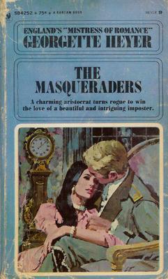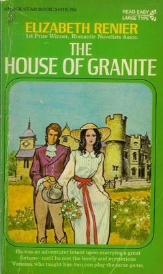
Okay, the next time you see a modern Regency cover and get frustrated that there’s a zipper there — remember that it could be worse! Regency covers nowadays, even at their very worst, are mostly historically accurate. In the past, even Georgette Heyer had some atrociously anachronistic covers. (Though I must admit, some of them were charming.) 🙂
This Heyer I admit I don’t find so charming. If I were in a bookstore looking at the book, I would mostly find it dull and drab — as well as, of course, a bizarre choice of clothing for a novel set during the 18th century. This is a Bantam edition from 1969. The hero has a very modern hairstyle, and — well, looking it over, I think the artist may have actually intended for the picture to be of a 1969 couple. But there were so many very inaccurate covers in the 1960’s — showing that clearly many artists had no concept of how period clothes were made, and the like — that I think it’s often honestly hard to tell if the picture was mean to be period or not!

With Megan Daniel’s “Miss Pennington’s Choice” we have the Regency flapper. True, the scene is at a masquerade — but what a clever costume, to see a hundred years into the future! This was published by Berkley through their Charter imprint, in 1988. Though looking more closely, I have decided that she isn’t even a 1920’s flapper — she’s a 1988 woman, complete with 1988 makeup and earrings, in a costume. (No flapper worth her feathers would have had cleavage like that! They all wanted to look like they had the figures of twelve-year-olds.) From a marketing point of view, the cover has its assets — it is bright and lively, and conveys a scene as well as a relationship.
That’s the most recent cover I have posted here — most are from the 1960’s.

Here’s a 1977 Ballantine edition of Alice Chetwynd Ley’s 1966 “The Master and the Maiden.” Here we have a Victorian lady in 1812! And I’m amazed by the detail the artist went to to portray a vastly inaccurate costume. The gentleman is much less detailed — but equally anachronistic, I think. The scene is somber, with a bizarrely spotty background. It does convey some emotion, but it certainly doesn’t look like a fun book.
Though, to be honest, I suspect it is also a fairly serious novel — I haven’t read it (at least, not recently enough to remember it), but it begins with an author’s note saying it is based on the Luddite Revolts. No, not light-hearted stuff.

In this 1968 Ace Books edition of Elizabeth Renier’s “The House of Granite” , we have a Regency hero with a 1960’s heroine. Hmm…. The art is simple, and a little weird — bold black lines around everything, lending an almost cartoony look on first glance. On second glance, I see the artist has gotten a surprising amount of detail in. I hate her dress, and the overall look is too Gothicky for me (I was never into books with heroines in nightgowns running away, and this has a bit of that feel), but for its era, it’s not actually that bad. (Which isn’t saying much, is it?)

The SeBastian cover is my favorite, in the same way that Wickham was Mr. Bennet’s favorite son-in-law. Yes, believe it or not, this book is set squarely during the Regency. But not only is the heroine in 18th Century dress, with a faux medieval hairstyle (!), the colors of her dress are hideous. This atrocity was committed by Popular Library in 1978. And even from just a marketing standpoint, I think it’s a terrible cover. It looks childish, and the heroine looks terribly passive. But I notice that the heroines on the Ley and the Heyer covers look quite passive too — I suspect it was the style of the period….
Cara
Cara King, MY LADY GAMESTER, Signet Regency 11/05
www.caraking.com

