I’m putting some serious thought into a long-needed upgrade to my rather lamentably home-made website, www.elenagreene.com and I’d love to have some input from readers.
Of course it is important to have a website that is uncluttered and easy to navigate. Although I personally don’t care to surf the web on my phone, but I know a lot of people do, so it’s also looking important to have a site that is mobile-friendly.
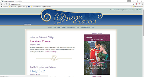
As for style, I’ve been looking through a lot of historical romance authors’ websites to get ideas of what might work for mine. One of my favorites is our own Risky Diane’s website at www.dianegaston.com. Here’s a screenshot. I think it’s elegant and has a romantic, historical feel without being too busy or flowery.
Some other website along these lines include: www.lorettachase.com and www.janmarieanello.com.
I also do happen to enjoy sites that have more imagery, including romantic couples and stately homes. Some examples: www.sarahmaclean.net and www.cynthiawrightauthor.com.
I’ve also noticed that some sites combine simple, elegant graphics with an author portrait. Examples: www.eloisajames.com and www.tessadare.com. I’d probably want to get a new headshot for this type of site, although that might be a good idea anyway.
So I’d love to hear what you think.
[poll id=”29″]
[poll id=”30″]
[poll id=”31″]
[poll id=”32″]
Please feel free to comment on any of your answers and let me know if there’s anything else you think is important.
Thanks!
Elena

