Back to Top

Tag Archives: Book covers


here’s my cover! It’s really, really pretty, but… they’re too young, too scrubbed-looking, and almost certainly too well-behaved. I asked for Harrison Ford with a bigger nose and Juliet Binoche. Personally I think it’s a mistake having people on covers, period, particularly on romances and particularly particularly on historicals where they get the costumes all wrong. (A red neckcloth???!)

If I could have the same art, but without the people, and with a stocking and a book lying on the sofa, that would have been fab. The worrisome thing about this cover is that it doesn’t deliver. It looks like a really sweet regency and it isn’t.

Janet


Hello everyone! Gail Eastwood here. I’m popping in for a visit thanks to the kind invitation of our Risky hostesses, most particularly Elena Greene, who has given me the opportunity to guest blog on first Fridays of alternate months. I am delighted to be here to share your gracious company and conversation, and also to help Elena gain a little more time to work on her newest work-in-progress. I have read a little of it and can’t wait for her to get it done!!

Some of you already know me, or may remember that I wrote Regencies for Signet back in the day, but for those who don’t, here’s a link to an interview Elena did with me a few months ago on this blog. Coming back to the writing realm after ten years makes me feel a little like Rip Van Winkle at times, so much as changed! It is indeed a brave new world, but I’m excited to jump into it.

If I may beg your indulgence, for this post I’d like to go back to the topic of cover art, picking up from Elena’s post of Sept 14. Elena shared her dilemma over “branding” her sexy short story Lady Em’s Indiscretion through her cover art. My own dilemma, as I prepared the first e-book reissue that I am doing myself, The Lady from Spain, was whether or not to go with a cover style similar to what the new Signet reissues have, or try something different.

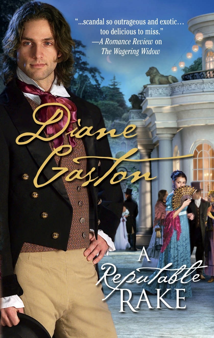
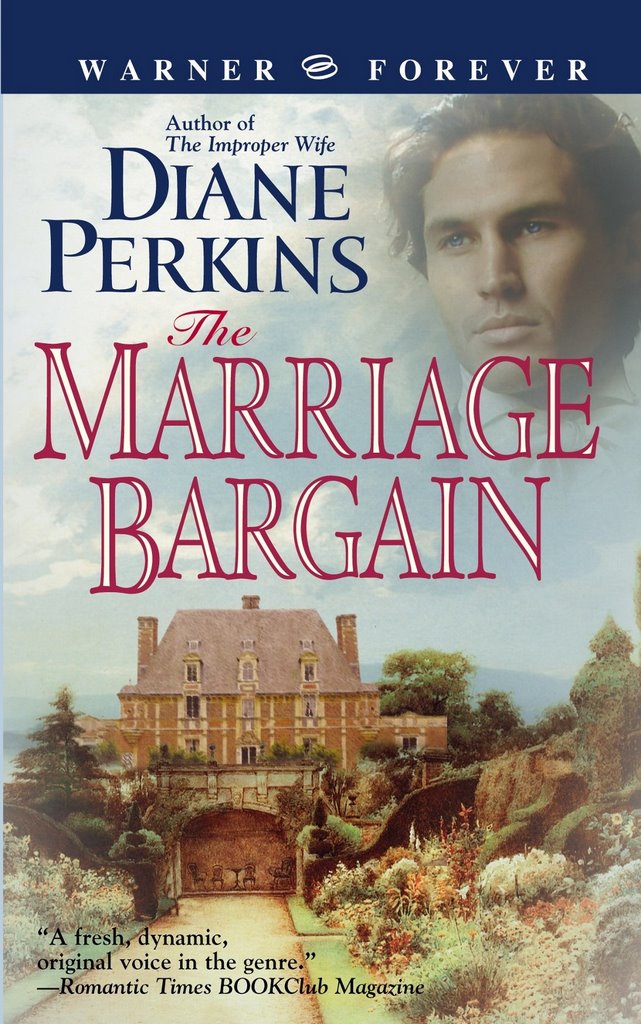
The Signet reissue e-books have taken a very different approach to their cover design, and I have yet to see anyone discussing it or reacting to it, and I’m dying to know what people think! Three of my books are being done this way.

As you can see below, I opted for “different” for the ones I am doing myself–all part of the grand experiment. For LFS, I wanted something that would suggest the suspense of the story and still atleast hint at the Regency time period. The story takes place mostly in London… The reissue of The Captain’s Dilemma, my French prisoner-of-war story pubbed in 1995, is not ready yet, but I will be working on converting it next!


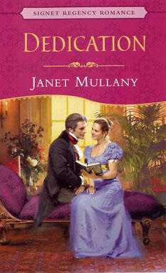
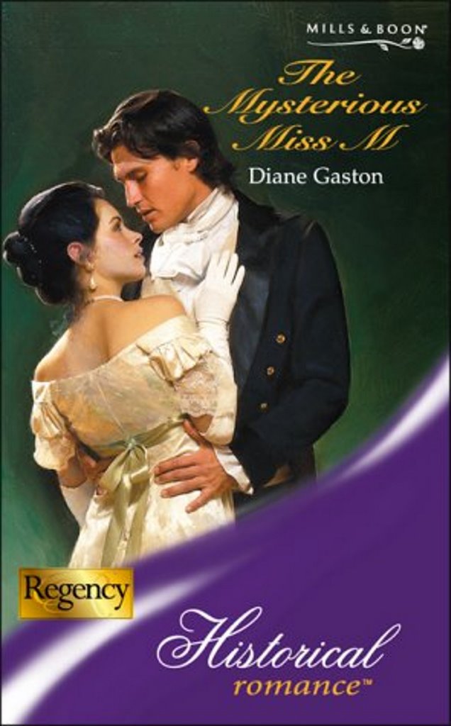
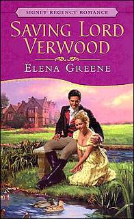
Here are the old versions of those covers. You can see more on my website or on my author pages at Amazon.

What “branding” messages do you get from the new ones? Like them? Dislike them? Do you want to see the characters, and if so, do you want to see both hero and heroine? What would you do instead?
If you’re interested in covers and/or how the designs have changed over time, here’s a link to a great website devoted to covers done by artist Allan Kass, who painted many Signet and other covers over a long career. It’s fun to look for your favorite authors in the archives, and sometimes recognize a favorite book!
Finally, I’m offering a free copy of The Lady from Spainto one lucky commenter, whose name will be drawn and announced by next Friday. So, please, join the conversation! And if you’d like to be part of the drawing, please be sure to include your preference for Kindle or Nook (the only formats available currently) or if you’re willing to wait for one of the other formats which will be available soon. Oh, and your email address!
Thanks so much for letting me visit with you today!

Elena’s and Ammanda’s rakes in yesterday’s Blog may be staring at…er…necks, but at what is my Reputable Rake staring? Whatever it is, he gives me an aerobic workout each time I look at him.

For the last week I have been searching for the name of the cover model for A Reputable Rake, the man with the devilish look of amusement on his face, standing so smugly. Do you know who told me the name? Richard Cerqueira’s (cover model for The Wagering Widow) publicist, who emailed the cover artist, Alan Ayers, who told him the name. Wasn’t that nice of both of them?

The Reputable Rake is Ben Whitaker, but I’ve found absolutely nothing about him on the internet. I predict we will be seeing more of him–more book covers, that is. I wish I could thank both Ben and Alan Ayers, because I think this cover is going to sell lots of books!

Do you know how Mills & Boon, the UK branch of Harlequin Enterprises, create their bookcovers? They go through their decades worth of old covers and re-use ones for today’s stories. They have done this wonderfully well for my Regencies, which originate with Mills & Boon.
Take a look at this cover:

These two look exactly like my hero and heroine! Miss M even wears a dress like this one. Jewelry like her, as well.

One more bookcover….

Okay, just kidding. I made that one up.

Cheers!
Diane

P.S. A Reputable Rake is in bookstores this month. Get your very own Rake and bring him home today!

My brother recently informed me of a study that seemed to explain something I’d wondered about.

But first, let me tell you my husband’s reaction when I first showed him the cover for Saving Lord Verwood, and commented on the fact that the gentleman on the cover actually looked a lot like I’d described him. And my husband’s reaction was something like, “Wha, there’s a man on the cover?” His next, more coherent observation was “Nice cleavage.” Then I realized that Verwood wasn’t looking at the ducks.

And I have doubts that the hero of Rules of Love (below) is actually reading the book the heroine is showing him. From the heroine’s amused expression, she’s got his number, too.

So what’s up with these handsome ne’er-do-wells ogling their heroines’ “necks” (the discreet term used during the Regency to describe everything above the décolletage)?

According to the article my brother showed me, the art departments aren’t just trying to portray gentlemen smitten with their ladies’ “charms”. They are showing that these heroes are health-conscious, well ahead of their time.

To quote:

“A new German study of 200 men over a five-year period revealed that staring at a woman’s bosom is good for a man’s health. Dr. Karen Weatherby, who carried out the study wrote in the Journal: “Just 10 minutes staring at the charms of a well endowed female each day is roughly equivalent to a 30-minute aerobic workout. There is no question, gazing at a woman’s breasts makes men healthier! It cuts the risk of heart attack and by doing so the average man can live up to five years longer.”

Alas for modern would-be rakes, this has been outed at www.snopes.com. Sorry guys! We have your number.

Elena 🙂
www.elenagreene.com
LADY DEARING’S MASQUERADE, RT Reviewers’ Choice Award nominee

Posted in Frivolity | Tagged | 6 Replies


Yikes! I may have confused which bookcover Michelle Buonfiglio of Romance B(u)y the Book said had Nathan Kamp on the cover. It might have been this bookcover!!

This fellow does look like Nathan Kamp!

So who is A REPUTABLE RAKE?????

My apologies to the model on A Reputable Rake. I am certain there are many readers dying to identify you. When I find out who you are, I will do a whole blog on you!

Diane (slinking away after making a major boo boo, she thinks)