Back to Top

Tag Archives: Book covers

This weekend I attended Washington Romance Writers Spring Retreat in Harpers Ferry, West Virginia, one of the highlights of my year. On Sunday of the Retreat we always have someone speak seriously on the Romance industry. That speech comes right before Nora Roberts’ speech, which is never serious! This year our guest speaker was Michelle Buonfiglio, Romance Columnist for Romance B(u)y the Book (www.WNBC.com/Romance) and her companion site Romance: by the Blog (http://romancebytheblog.blogspot.com/) I knew nothing of these sites! Michelle reviews Romance novels in her column and is a wonderful advocate for the genre. I urge everyone to read the column and visit the blog.

Michelle announced to the group that my cover of A REPUTABLE RAKE (on display along with our other authors’ bookcovers) featured cover model Nathan Kamp.
Here is the cover:

(I think my Rake is sooo handsome and I love that hint of devilment in his expression)

Here is a photo of Nathan Kamp:

What do you think? Is this the same guy?

If you would like your very own Rake, A REPUTABLE RAKE by Diane Gaston should be available in your bookstores TODAY.

By the way, Romance B(u)y the Book will feature an interview with Nathan Kamp on May 9 and May 16.

Speaking of cover models, I’ve teamed up with Richard Cerqueira for a promotion at the Romantic Times Booklovers convention in Daytona Beach May 16 to May 21. For attendees, I will be raffling two cover flats of THE WAGERING WIDOW, signed by me and Richard Cerqueira. I’ll also be giving away Richard’s bookmarks.

Here is a picture of Richard on my February release, THE WAGERING WIDOW:

Well, that’s Richard’s hand, but a very strong and sexy hand.

Here is a better photo from the book spine:

And another—not in Regency garb.

Richard is perfect in Regency clothes ( and out of them, too! ) I hope all of him appears on the FRONT of one of my books sometime. Properly dressed in buckskins and hessians, of course.

Aren’t I lucky in my Regency heroes?

And just so you do not think I am unfaithful to GB

Cheers!
Diane

Don’t worry, this is still Risky Regencies and you have not been transported to some strange country.

Or only a bit strange—they have, at least, heard of Jane Austen. They even quite cleverly translated the title to keep the alliteration. This is Pride and Prejudice, a copy my mother brought back from her twice-annual trip to Lithuania.

Both my parents emigrated from Lithuania as children. Though I was born in the U.S., my first language was Lithuanian. In fact, I went to kindergarten knowing very little English. Perhaps not the smoothest way to integrate a child into a “new” country, but somehow I managed. I know that growing up bilingual has made other languages (perhaps even computer languages) easier. Still, I sometimes wonder if I can blame my occasional awkwardness with word choices and phrasing on this early linguistic confusion. Or maybe not. Maybe I’m just the Queen of Awkward Sentences, doomed to seemingly eternal revisions. 🙂

Anyway, I find this book and its packaging quite interesting. Though the title is clever the cover art is many centuries off. One would think they could have found something more appropriate. At least it’s not Victorian!

I read the back blurb, and was surprised to see that they gave the entire plot in a nutshell, spoilers and all. If, that is, there is such a thing as a spoiler for a book that’s been around since 1813.

Overall, it makes me happy people all over the globe can enjoy Jane’s genius. I wonder how she would feel about seeing her works in so many translations? Have any of you run across any other interesting translations? What have your experiences been with foreign languages? How do they affect your reading and writing?

Elena, hoping someday there will be Lithuanian editions of her own works
www.elenagreene.com
LADY DEARING’S MASQUERADE, an RT Reviewers’ Choice Award nominee


I’ve been meaning to show my January Cover and it occurred to me this morning that time is flying. I’ve been a bit engrossed in what I will do from this time forward, and so I am apologizing to the Muse of this book, who is at this moment quite annoyed with me.

I especially love this cover, and am very thankful, for it is my last traditional Regency. I love both of the characters–the heroine with her atypical appearance (she is brunette to begin with), and the hero looks mature and very real. I am grateful to the artist for this lovely work.

Laurie
LORD RYBURN’S APPRENTICE
Signet, Jan. ’06

Here are some Regency covers I really like! They’re shown here in approximate order of publication.

This Georgette Heyer cover is done by the famous cover artist Barbosa, for the 1957 SYLVESTER: OR, THE WICKED UNCLE released by Heinemann. I love the coach in the background, and the way Sylvester dominates the picture. He’s standing in shadow, too, to make him seem just a little bit mysterious…or wicked. Our Sylvester has no false modesty; he says “there are not five but a dozen young women of rank and fashion who are perfectly ready to receive an offer from me.” Hmmm…definitely needs to be taught a lesson!

Joan Smith’s SWEET AND TWENTY (Fawcett, 1979) has a charming cover. I love the shops in the background, and the pretty young thing center stage. What I find really intriguing is that this pretty young thing is not the heroine, but her empty-headed cousin! In chapter one, this creature exclaims, “Cousin, have you read a book too?” in wonderment. Ah, silly young ladies. Gotta love them.

In 1981, Warner brought us PRETTY KITTY by Zabrina Faire. (Yes, it was a pen name!) I love the heroine’s big eyes and curly hair, and the action-packed background (a city in flame, with cannon firing at it? You don’t see that on every Regency cover!) The hero a bloody bandage, too–and a lovely sword. Ah, those military heroes… He inadvertantly compromises the heroine, and then becomes engaged to her, without ever knowing her name!

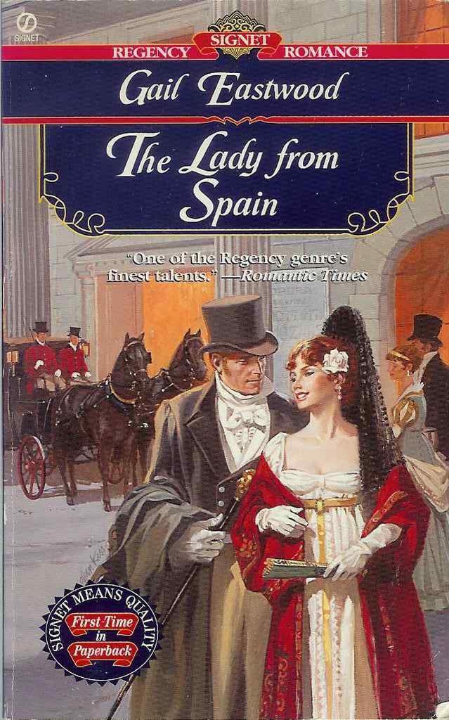
I was never the biggest fan of Signet’s older covers, the ones that tended to shades of brown and olive–they always looked rather dreary to me. But some of them were lovely, such as this 1997 cover for Gail Eastwood’s THE LADY FROM SPAIN. I think the colors go wonderfully together, and the entire composition is just pleasing to the eye. The carriage and horses in the background is a plus! The hero is dapper, and the heroine’s costume hints at interesting things. Indeed, on the first page we learn of her: For now it suited her purposes to be taken for a foreigner… Definitely intriguing!

Here’s a lovely cover for Amanda McCabe’s 2002 THE GOLDEN FEATHER. What makes this cover stand out for me is the lighting — the whole feeling here, the mood, the mystery is created by the way the artist handles the light. The gaming table in the background promises interesting historical detail, and heroine’s mask hints at an intriguing character! And at least part of the picture is accurate; when the hero sees the heroine, he notices: Mrs. Archer was very striking. And she did indeed have a magnificent bosom, its whiteness set off by the low bodice of her green satin gown.

Here’s one for Amanda, who loves headless characters! Well, these are half headless, anyway. A lovely and unusual Signet cover, from April of this year, for Sophia Nash’s LORD WILL & HER GRACE. So…is the heroine kissing him? Turning away as he tries to kiss her? Ah, the questions this covers creates! The pose looks simple at first glance, but another look shows the tense way she holds her fan, and the way her body is turned quite away from him…definitely makes one want to find out more!

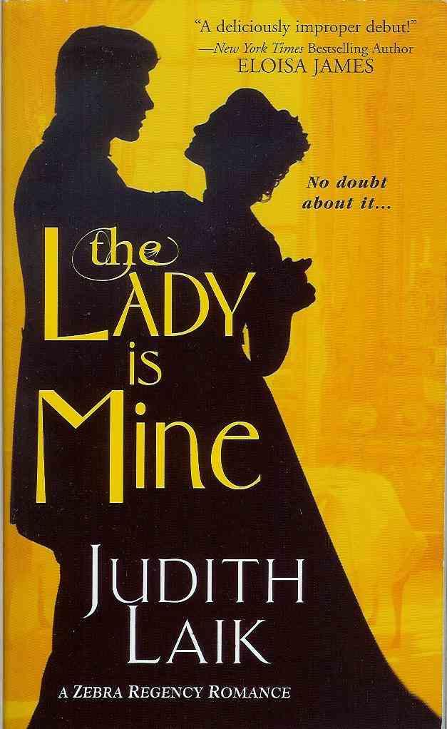
Here’s one of Zebra’s gorgeous covers from earlier this year — May, to be precise — for Judith Laik’s THE LADY IS MINE. I love the silhouette (and her later book had a similar silhouette, but with purple in the background). It’s elegant and lovely, and very very Regency. Even better, if you look closely, you can see all sorts of things in the yellow background! Definitely one of my favorite covers. It doesn’t reveal much about the story, but a cover like this doesn’t need to…even for a hero who talks about potential brides thus: “After all, one can’t spend all one’s time in bed. Over the years one will occasionally have to chat with the woman.” Hmm…perhaps another man who needs to be taught a lesson! 🙂

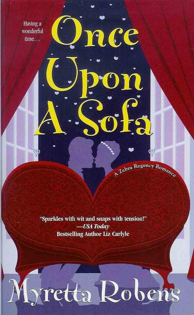
I positively adore this cartoon cover for Myretta Robens’ ONCE UPON A SOFA, which was another May 2005 release from Zebra. It’s funny, it’s catchy, it’s bright and colorful, and it’s very very new. The colors, the composition — everything is perfect!

So — which of these covers do you like best? Why? What sort of covers do you like in general? (Amanda doesn’t have to answer — we know she likes headless people best! BTW, Amanda, are you a fan of Washington Irving, by any chance???) 🙂

Cara
Cara King, www.caraking.com
MY LADY GAMESTER, Signet Regency November 2005

Posted in Reading, Regency | Tagged | 11 Replies

Okay, the next time you see a modern Regency cover and get frustrated that there’s a zipper there — remember that it could be worse! Regency covers nowadays, even at their very worst, are mostly historically accurate. In the past, even Georgette Heyer had some atrociously anachronistic covers. (Though I must admit, some of them were charming.) 🙂

This Heyer I admit I don’t find so charming. If I were in a bookstore looking at the book, I would mostly find it dull and drab — as well as, of course, a bizarre choice of clothing for a novel set during the 18th century. This is a Bantam edition from 1969. The hero has a very modern hairstyle, and — well, looking it over, I think the artist may have actually intended for the picture to be of a 1969 couple. But there were so many very inaccurate covers in the 1960’s — showing that clearly many artists had no concept of how period clothes were made, and the like — that I think it’s often honestly hard to tell if the picture was mean to be period or not!

With Megan Daniel’s “Miss Pennington’s Choice” we have the Regency flapper. True, the scene is at a masquerade — but what a clever costume, to see a hundred years into the future! This was published by Berkley through their Charter imprint, in 1988. Though looking more closely, I have decided that she isn’t even a 1920’s flapper — she’s a 1988 woman, complete with 1988 makeup and earrings, in a costume. (No flapper worth her feathers would have had cleavage like that! They all wanted to look like they had the figures of twelve-year-olds.) From a marketing point of view, the cover has its assets — it is bright and lively, and conveys a scene as well as a relationship.

That’s the most recent cover I have posted here — most are from the 1960’s.

Here’s a 1977 Ballantine edition of Alice Chetwynd Ley’s 1966 “The Master and the Maiden.” Here we have a Victorian lady in 1812! And I’m amazed by the detail the artist went to to portray a vastly inaccurate costume. The gentleman is much less detailed — but equally anachronistic, I think. The scene is somber, with a bizarrely spotty background. It does convey some emotion, but it certainly doesn’t look like a fun book.

Though, to be honest, I suspect it is also a fairly serious novel — I haven’t read it (at least, not recently enough to remember it), but it begins with an author’s note saying it is based on the Luddite Revolts. No, not light-hearted stuff.

In this 1968 Ace Books edition of Elizabeth Renier’s “The House of Granite” , we have a Regency hero with a 1960’s heroine. Hmm…. The art is simple, and a little weird — bold black lines around everything, lending an almost cartoony look on first glance. On second glance, I see the artist has gotten a surprising amount of detail in. I hate her dress, and the overall look is too Gothicky for me (I was never into books with heroines in nightgowns running away, and this has a bit of that feel), but for its era, it’s not actually that bad. (Which isn’t saying much, is it?)

The SeBastian cover is my favorite, in the same way that Wickham was Mr. Bennet’s favorite son-in-law. Yes, believe it or not, this book is set squarely during the Regency. But not only is the heroine in 18th Century dress, with a faux medieval hairstyle (!), the colors of her dress are hideous. This atrocity was committed by Popular Library in 1978. And even from just a marketing standpoint, I think it’s a terrible cover. It looks childish, and the heroine looks terribly passive. But I notice that the heroines on the Ley and the Heyer covers look quite passive too — I suspect it was the style of the period….

Cara
Cara King, MY LADY GAMESTER, Signet Regency 11/05
www.caraking.com

Posted in Reading, Regency | Tagged | 12 Replies