A few days ago, I got a packet of cover flats for my next book, A TANGLED WEB. I like it all right–the purple color is very pretty and rich, the couple not quite as cute-sy as some (though that scene never really happened in the story, and the heroine would NEVER wear purple polyester!). But it made me start thinking about a subject near to every author’s heart–covers. The good, the bad, the ugly.
For better or worse, a cover (something we have zilch control over) can have a huge influence on sales. A vivid, beautiful, interesting cover can grab a reader’s eye and make them pick the book up off the shelf. A bad, ugly, or just plain bland cover can mean that the book, our “baby”, is overlooked, turned away from, even (gasp!) made fun of. (See the hilarious Worst Cover category in AAR’s annual cover contest).
These days there is a vast array of styles out there. There are still old-style clinches. You know the ones–anatomically improbable people falling out of their clothes, bent into poses that would mean a trip to the ER in real life and months in traction. Or my personal cliche favorite, one which seems to pop up often at Avon, the bacon-brained hero who forgot to put his shirt on before running out into the snow after the negligee-clad heroine. But he DID remember his cheesy Wal Mart vampire cape.
There are cartoon covers, some of which are cute and suit the story, some just–weird. There are flowers, castles, pearls, and other inanimate objects. There is hero alone (usually displaying his manly chest), heroine alone, headless people (I actually like these very much), classic paintings. A few I’ve noticed lately:

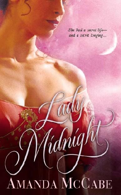
 Liz Carlyle’s ONE LITTLE SIN–headless people, great, bright colors, very eye-catching and sexy without being ludicrous. She’s had several great covers. I’m jealous.
Gaelen Foley’s ONE NIGHT OF SIN–personifcation of headless couple-dom. Red background, very sexy.

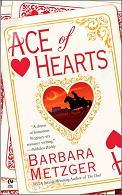 Barbara Metzger’s ACE OF HEARTS–her previous historicals had that nice headless couple design, misty colors, very pretty, but this one–WTF? Looks like some weird Halloween Western.
Laura Kinsale’s SHADOWHEART–amazing book, boring cover. This story screams out for a gorgeous Italian Renaissance painting. Maybe a detail of a Botticelli?

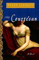 And speaking of paintings, there are Susan Carroll’s THE DARK QUEEN and THE COURTESAN. Again, amazingly terrific books. They look good, too, trade size, 1/4 bright foil, 3/4 a detail of a beautiful painting. BUT–the stories take place in the 16th century. DARK QUEEN features a fluffy Boucher painting; COURTESAN a portrait of Empress Josephine. Very distracting.
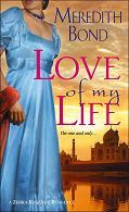 Meredith Bond’s LOVE OF MY LIFE–one of those gorgeous Zebra covers that didn’t get a chance. Headless heroine in a vivid turquoise gown, Taj Mahal in the background. Great.
So, what covers do you like/dislike? What would make you pick up a book–or run away screaming in horror? What are some all-time favorites?