Back to Top

Tag Archives: covers

First of all, to start off my week I got a brand new cover!  This book is coming out in October, a sort of sequel to The Winter Queen set at the court of Mary Queen of Scots (I loved doing the research for this one!).  She has a lot of hair, but just like with my last Harlequin cover I wanna steal her dress…

And when I was searching around for something  for today’s blog, I found out that June 26 marks the anniversary of the opening of the V&A museum in its current location!  The Victorian Albert is the world’s largest museum of decorative arts and design, with 4.5 million objects over 145 galleries covering 12.5 acres.  Their collections cover design objects from all over world and in every medium imaginable.

The origins of the museum were in the Great Exhibition of 1851, objects from which formed the nucleus of the first collection.  (Prince Albert was always very keen to promote English arts and design).  It was called the Museum of Manufactures and opened in May 1852 at Marlborough House.  The cornerstone of the current Aston Webb-designed building was laid in May 1899, the last official public appearance of Queen Victoria.  It was officially opened to the public by Edward VII and Queen Alexandra on June 26, 1909 and has undergone numerous extensions since then (including right now).

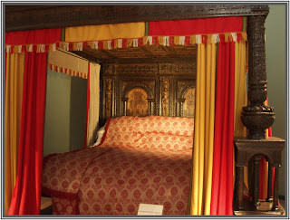
Just a few of their objects are the Great Bed of Ware (mentioned in Shakespeare plays, see pic below); Henry VIII’s writing desk; the complete Music Room from Norfolk House, 1756; a costume collection of 14,000 objects from 1600 to the present; jewels such as Marie Antoinette’s bracelets and the Beauharnais emerald necklace, given by Napoleon to his stepdaughter; the 13th century Sicilian Tristan quilt; and so, so, so much more.  Plus great shops.

Recently the Oklahoma City Museum of Art hosted a great traveling exhibit of objects from the V&A, including clothes, George III’s walking stick, silver and porcelain, furniture, and a writing table belonging to Marie Antoinette.  It was a small but beautifully selected exhibit, and I visited it several times!  (One of my favorite things they had was this portrait of Madame de Pompadour):

To see explore the museum a bit yourself, visit them here!

Have you been to the V&A?  What was your favorite thing there?  And what do you think of the cover??

First, my apologies for missing two weeks in a row. The first time, I was just off by an  day. Last week, I just entirely forgot. Things have been crazy busy. I sent Book two of the Sinclair Sisters series — A Notorious Ruin — out for a first round read. Then I started writing a My Immortals novella, currently titled Dead Drop. It’s for a paranormal anthology and I have to write really really fast. I am on track so far.  But I have to keep to a very aggressive word count. Whew!


Covers

I’ve been thinking about covers lately. Looking at lots of images and covers and I’ve been thinking. In the traditional publishing world, if you were selling well enough, you might get a step-back cover. Where the front cover might be a little short width-wise but underneath is more cover and the two make a cohesive image. When you open the top cover, you see a bigger image. I liked step backs. Most of the time, they are very pretty and fun and the artwork is nice.

I’ve not seen anyone doing the equivalent in eBooks. There are a bunch of ways to deal with expanding out an images that’s probably more complicated than it’s worth — except, maybe not. In the hands of the right artist it could be neat. Plus, there’s always the simple thing of just adding another image. A super duper sexy one (if appropriate) or maybe just a beautiful illustration. I’m talking just about some extra bling in the book, not turning into an graphic novel or something.

So, I ask you, assuming you are not making an author-based decision, what kind of covers do you like? What are the things that appeal to you? Colors? Details? Couples? Just the guy? Just the girl? Potted plants?

Assuming an additional image(s) in an eBook didn’t pose a technical annoyance to you (slowing down the device or what have you), how might you feel about a second image inside the book — step-backish in that it’s kind of a cover enhanced? What if there were an illustration?

Let me know in the comments.

Oh! Hey! Also this!

If you are reading this on April 30, it’s my birthday! I’ll send a commenter a surprise thing. Not worth more than forty bucks US, because that’s my budget. It’s a surprise because I just realized tomorrow is my birthday and so I’m not prepared. International is OK.

No purchase necessary. Void where prohibited. Must be 18 to enter. My relatives are not eligible to enter. If I had employees they wouldn’t be eligible either. Winner chosen at random from among the commenters who comment BEFORE midnight April 30th, 2014 Pacific Time. This blog is in the Eastern Time zone, so technically you have until the blog says 2:59:59 AM May 1, 2014.

Lady Em's Indiscretion Original CoverThis is the original cover for my sexy novella, Lady Em’s Indiscretion. I think it’s lovely, as are all my covers from Kim Killion. However, it turns out to have been an error in branding.

After publishing it, I learned that some readers do not read book descriptions before buying. There were complaints that it was too short and too sexy. My guess is the cover and title were too much like the cover and title of Lady Dearing’s Masquerade and misled some people into thinking Lady Em’s Indiscretion would be another long historical, sexy but with many other story elements. This, even though the description included the words “sexy” and “novella”. 

Lady Em's Indiscretion - New Cover
Anyway, there’s no point in blaming readers. So after a while, I asked Kim Killion to do a different cover, one that would make the heat level more obvious. Here’s what she came up with. Although I’m sad the folly had to go, since the switch reviews have been consistently positive. I only wish I’d done it sooner. Live and learn.

What readers are saying now:

“What a great story. A sweet romance of hope everlasting and the power of physical attraction. I really enjoyed the read, quick and very fun.”

“I don’t think the bad reviewers were really paying attention to what they were buying. This is a SHORT and sensual story, well worth the 99 cents I paid for it. It is well-written and sexy, and the author has a good sense of the time period.”

Lady Em’s Indiscretion is free on Amazon today through February 4. Just please do NOT download if you are looking for a sweet traditional Regency!

Which cover do you like best? What sorts of covers signal sexy to you?

Elena
www.elenagreene.com

Maybe I shouldn’t admit this, but I’m kind of lukewarm about the covers put on the old Regency anthologies.

Here’s one for an anthology in which a friend, Patricia Bray, had a story. The kittens on the cover are adorable, but they don’t say “romance” to me and the stories inside focused more on the paranormal than the cuteness.

I have mixed feelings about the Christmas anthology covers that seem to imply that the season itself somehow guarantees a happy ending. But a lot of Christmas novellas don’t actually use the holiday as a gimmick. In fact, the title of this one, with Risky Amanda as one of the contributors, actually refers to paranormal elements in this anthology. Much more fun.

I’ve only participated in one anthology myself, HIS BLUSHING BRIDE, with Alice Holden and our good friend and occasional Risky guest, Regina Scott. When I first saw the cover, I knew that though the Valentine-y treatment wasn’t my thing, it would appeal to a lot of readers. (The book sold pretty well.) Still, I went for a different look for the cover for the reissue of my story from that anthology, The Wedding Wager.

What do you think? Do you go for anthologies or novellas with the cute covers, or are there other types of covers you prefer?

I’ll be giving away 5 Kindle or Nook copies of The Wedding Wager to commenters chosen at random. If you win, you can also nominate a friend to receive a free copy. Void where prohibited. You must be over 18. No purchase necessary. Post your comment by midnight EST on February 24th. I will post an announcement on Saturday, February 25, so please check back to see if you have won.

Elena

Posted in Uncategorized | Tagged , , | 17 Replies

Last week I blogged about the actresses I used as inspiration for my heroines. I said then that I was less happy with the cover art for some of my heroes and this week I’ll prove it!

For the hero of LORD LANGDON’S KISS I suggested Rutger Hauer. I was on a Ladyhawke kick (anyone else love that movie?) and though of course the garb is not period, the whole “stalwart knight” thing suited his personality. I don’t think that quality translated through the obligatory Regency smile but at least he is tall and blond as I described him.


Part of my inspiration for Philip, the hero of THE INCORRIGIBLE LADY CATHERINE, was a recording I had of Bryn Terfel singing folk songs. I imagined Philip as a man with a wonderful, rich baritone voice, not conventionally handsome but with striking eyes. I sent in an image of Terfel that I thought might work but what a mistake that was! Can you feel my pain?


With THE REDWYCK CHARM my luck improved. I sent in Michael Vartan and though I’m not sure this cover hero resembles him (and the hair is a bit weird) at least he is good-looking!


My best cover hero came in SAVING LORD VERWOOD. I learned later that the cover model was the popular John DeSalvo but he does capture the look I was going for with Jeremy Northam. Overall, it was a nice cover and came in 3rd in the historical series category of the All About Romance cover contest that year. I’m not complaining, this hero is very fine. 🙂


Now to my last cover hero. I sent in Colin Firth and got…this dude. Ack! I was glad the background color was striking and the actual image was so small. If anyone could really tell how Very Wrong this hero looks, I would have cried.

So what do you think?

And though I already know the likely suspects, who would you most like to see on a romance cover?

Elena
www.elenagreene.com